Android Studio TextView Tutorial with Examples
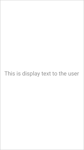
A TextView is a GUI component that consists of text. TextViews are used to display text to the user.
Example of TextView in XML

Attributes of TextView
android:layout_width - This attribute is used to set width of a TextView. It is required attribute.
Values of layout_width attribute :
match_parent : It will set the TextView width according to the parent layout's width. For example, if the width of a parent layout is 200dp then the width of a TextView is also 200dp.
wrap_content : It will set the TextView width according to the length of text in the TextView. TextView width is also increased or decreased when its text is increased or decreased
other : You can also set width in dp or px like 200dp, 50px, etc. It will set width according to your device's screen resolution.
android:layout_height - This attribute is used to set height of a TextView. It is required attribute.
Values of layout_height attribute :
match_parent : It will set the TextView height according to the parent layout's height. For example, if the height of a parent layout is 200dp then the height of a TextView is also 200dp.
wrap_content : It will set the TextView height according to the length of text in the TextView. TextView height is also increased or decreased when its text is increased or decreased
other : You can also set height in dp or px like 200dp, 50px, etc. It will set height according to your device's screen resolution.

android:layout_marginStart - This attribute is used to give extra space from left side of the TextView.
Values of layout_marginStart attribute :
You can set its value in dp or px like 20dp, 50px, etc.
android:layout_marginEnd - This attribute is used to give extra space from right side of the TextView.
Values of layout_marginEnd attribute :
You can set its value in dp or px like 20dp, 50px, etc.
android:layout_marginTop - This attribute is used to give extra space from top of the TextView.
Values of layout_marginTop attribute :
You can set its value in dp or px like 20dp, 50px, etc.
android:layout_marginBottom - This attribute is used to give extra space from bottom of the TextView.
Values of layout_marginBottom attribute :
You can set its value in dp or px like 20dp, 50px, etc.
android:layout_margin - This attribute is used to give extra space from every side (left, right, top, bottom) of the TextView.
Values of layout_margin attribute :
You can set its value in dp or px like 20dp, 50px, etc.

android:paddingStart - This attribute is used to give inside space between text and left side of TextView edge.
Values of paddingStart attribute :
You can set its value in dp or px like 20dp, 50px, etc.
android:paddingEnd - This attribute is used to give inside space between text and right side of TextView edge.
Values of paddingEnd attribute :
You can set its value in dp or px like 20dp, 50px, etc.
android:paddingTop - This attribute is used to give inside space between text and top side of TextView edge.
Values of paddingTop attribute :
You can set its value in dp or px like 20dp, 50px, etc.
android:paddingBottom - This attribute is used to give inside space between text and every side of TextView.
Values of paddingBottom attribute :
You can set its value in dp or px like 20dp, 50px, etc.
android:padding - This attribute is used to give inside space between text and every side of TextView edge.
Values of padding attribute :
You can set its value in dp or px like 20dp, 50px, etc.
android:text - This attribute is used to write text on a TextView.
Values of text attribute :
You can set any String value like "Learnoset", "Coding", "Android", etc.
android:textColor - This attribute is used to change text color of a TextView.

Values of textColor attribute :
You can use color codes like "#000000", "#FFFFFF", etc. or you can also get value from colors.xml file like "@color/black"
android:textSize - This attribute is used to change text size of a TextView.

Values of textSize attribute :
You can set text size in dp, px, sp like 10dp, 20px, 18sp, etc.
android:textStyle - This attribute is used to set style of text on a TextView like bold, italic, normal.

Values of textStyle attribute :
bold : To make text bold
italic : To make text italic
normal : To make text normal (remove italic and bold style)
combined : You can also use multiple values like bold|italic by using '|' symbol in between.
android:textAllCaps - This attribute is used to make text in UPPERCASE or lowercase.

Values of textAllCaps attribute :
true : Text in uppercase
false : Text in lowercase
android:background - This attribute is used to set background of a TextView

Values of background attribute :
You can use a color as TextView background like "#000000", "#FFFFFF", @color/black
You can also use an image from drawable folder as TextView background like @drawable/you_image_name
android:drawableStart - This attribute is used set an image on left side of a TextView

Values of drawableStart attribute :
You can also use an image from drawable folder like @drawable/you_image_name
Note: Use small images with resolution of 24px or 36px.
android:drawableEnd - This attribute is used to set an image on right side of a TextView

Values of drawableEnd attribute :
You can also use an image from drawable folder like @drawable/you_image_name
Note: Use small images with resolution of 24px or 36px.
android:drawableTop - This attribute is used to set an image on top side of a TextView

Values of drawableTop attribute :
You can also use an image from drawable folder like @drawable/you_image_name
Note: Use small images with resolution of 24px or 36px.
android:drawableBottom - This attribute is used set an image on bottom side of a TextView

Values of drawableBottom attribute :
You can also use an image from drawable folder like @drawable/you_image_name
Note: Use small images with resolution of 24px or 36px.
If you have any Questions or Queries
You can mail us at mohsinrahman318@gmail.com


0 Comments